The proliferation of mobile computing devices in recent years has meant that websites can no longer remain static or stick to one screen resolution or aspect ratio. Your organisation's website should be optimised for a variety of devices and resolutions, to reach the widest number of users possible. But how to test your website when you don't own every device? Screenfly, a great tool from QuirkTools, allows you to virtually view any website in a variety of resolutions. There are presets for common devices, or you can set a custom resolution or rotation.
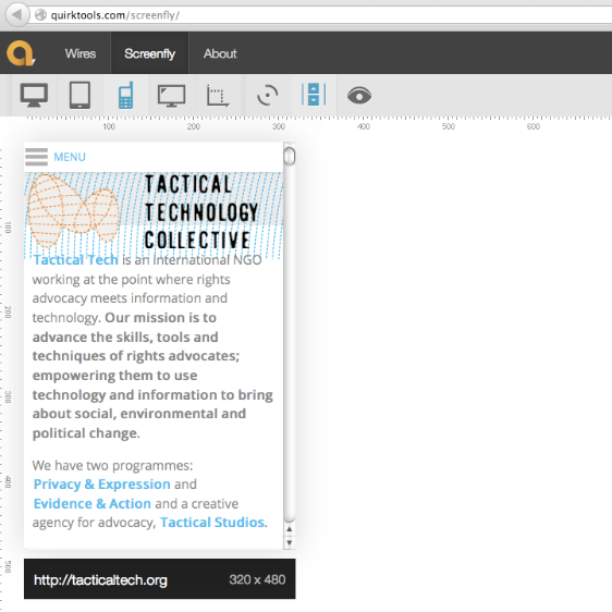
Screenshots:
What can I use it for:
Quickly testing the appearance and behaviour your website.
Pros:
Simple, straightforward browser-based interface.
Does not require you to sign up to use the service.
Cons:
Rather limited options.
Platform (OS):
Online
License:
Free
Website:
Difficulty:
Easy
Training Materials:
Other Resources: