Tips on creating print media
- Consider your distribution format when composing your text. For posters or protest signs, less is more. You want a punchy tagline and the most important information in a large font for visibility. For handouts or flyers, which people are more likely to take with them or read, longer text is appropriate.
- Focus your message and distill information down to essentials. Eye-catching images, graphics and typography are paramount, but nothing will stick in the memory unless the message is focused.
- Always proofread your text. Print is a a physical medium and is not as forgiving of errors or typos as online media. If you are printing a large run of materials, double-proofread your text! Consider handing it to someone else to look over with a fresh eye.
- Consider printing quality when selecting your images. If your images are in colour and you are printing in black and white, always convert your images to black and white to ensure that the image still retains its impact when stripped of its colour. Make sure also that the quality of your printing is high enough to preserve the different shades of contrast of a black and white image. Photocopied materials tend to flatten contrast to extreme blacks and whites.
- When designing a poster, marry form with content and think about the flow of information and the path that the eye traces through it. The most important piece of content should be large and its colour and font should draw the eye to it. The eye will pass over content from top to bottom, and left to right in most languages; right to left in Arabic; and in some cases, as in Japanese, both right to left and left to right are possible.
- Don't always trust the screen. Always test-print a proof copy before ordering the final run of printing. This will allow you to detect variations in colour and resolution that are not necessarily visible on a computer monitor, even a very good one. You may need to adjust the brightness, contrast or colour in a way that makes your media look 'wrong' on screen but just right when printed.
- Images should be at least 600 dpi for printed materials. Web images, which look passable at 72 dpi on a screen, look pixelated when printed at a higher resolution. For printing, low resolution images are rarely adequate for printing - high resolution images are a must. The higher the better. On the other hand, having your web images at a lower resolution isn't a bad thing either - it keeps their file sizes down and allows your website to load faster.
- Make sure that you have agreed in writing with the image creator or the rights holder that you can legally use the image in question. Even many Creative Commons-licenced images require an attribution credit.
Tips on choosing formats
- When deciding which format to choose, think about your goals, capacity and audience. Are you trying to get people to act fast on an issue, or do you have a message that makes sense on its own and will not date quickly? Simple messages can go onto smaller, one-off formats like posters, stickers and t-shirts, or in booklets or pamphlets, which can include a link to more frequent updates on your website. Posters or stickers can be put up by volunteers, and fliers can be handed out at demonstrations.
- If you want to engage people over the longer term by giving them an in-depth understanding of the issues involved in your cause, or if your messages are evolving all the time and are related to other developments, then a newsletter or magazine is best.
- To highlight a particular subject you could issue a one-off publication such as a briefing paper or communiqué – but don’t tell your audience it will form part of a series unless you are committed to producing further issues.
- A longer text might need to be published as a report or even as a book. If your budget is smaller, it could become an e-book for downloading. Remember that anything published online can be updated more regularly, cheaply and easily. Using a combination of formats is the best way to reach all your goals and audiences in the short and long term.
Tips on editing
- Read through – always read the whole document once through before making any changes.
- Show respect for contributors, whether your organisation edits heavily to underline specific goals, or lightly to favour authors’ voices.
- Accountability – have a solid reason for any changes. Ask questions when you are not sure what something means.
- Consistency – use your style guide and common sense to achieve this with punctuation, capitalisation, spelling, etc.
- Humility – save time and be respectful by only changing what you must to achieve your goals.
- Fact-checking – who is accountable for the factual information you are publishing? What are your sign-off procedures? Is information accurate and up to date? Use the internet or check with your author. Allow time for this.
- Clarity & readability – break up long paragraphs and sentences. Use the active voice rather than the passive voice. Avoid jargon. Does it flow logically?
- Content – is all the information the reader needs included?
- Tightening and cutting – eliminate redundant words, excessive adjectives and distracting detail. Fix vague language and repetition: use your thesaurus! Cut the least important information out but save versions in case you need to go back and retrieve anything.
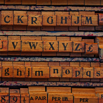
Image credit: This photo is made available under a Creative Commons by-nc-sa licence via Leo Reynolds on Flickr.